Stylised rendering techniques are cool, and with programmable shader hardware they can be easy to implement, too. This article discusses how such effects can be applied as a postprocess over the top of a conventional renderer. The goal is to have minimal impact on the structure of an existing engine, so that if you are already using a hundred different shaders, adding a new stylised filter should only increase this to a hundred and one, rather than needing a modified version of every existing shader.
The idea is to render your scene as normal, but to an offscreen texture instead of directly to the D3D backbuffer. The resulting image is then copied across to the backbuffer by drawing a single fullscreen quad, using a pixel shader to modify the data en-route. Because this filter is applied entirely as a 2D image space process, it requires no knowledge of the preceding renderer. In fact, these techniques can just as easily be used over the top of video playback as with the output of a realtime 3D engine.
The first step in getting ready to apply a postprocessing filter is setting up a swapchain that lets you hook in a custom pixel shader operation. A typical D3D swapchain looks something like:
D3D Backbuffer -> IDirect3DDevice9:Present() -> D3D Frontbuffer
Depending on which D3DSWAPEFFECT you specified when creating the device, the Present() call might swap the two buffers, or it might copy data from the backbuffer to the frontbuffer, but either way there is no room for you to insert your own shader anywhere in this process.
To set up a postprocessing filter, you need to create a texture with D3DUSAGE_RENDERTARGET, and an associated depth buffer. You can then set EnableAutoDepthStencil to FALSE in the D3DPRESENT_PARAMETERS structure, since you will not need a depth buffer while drawing to the D3D backbuffer. This results in a triple buffered swapchain:
RenderTarget -> Filter -> D3D Backbuffer -> Present() -> D3D Frontbuffer
The rendering process now looks like:
An incidental benefit of extending the swapchain in this way is that if you create your device with D3DSWAPEFFECT_COPY (so the D3D backbuffer will persist from one frame to the next), you can turn on alpha blending during the filter operation to get a cheap fullscreen motion blur, blending in some proportion of the previous frame along with the newly rendered image.
The main disadvantage is that texture rendertargets do not support multisampling, so you cannot use any of the clever antialiasing techniques found in modern GPUs.
Display resolutions tend to have dimensions like 640x480, 1024x768, or 1280x1024, which are not powers of two. This is ok as long as the driver exposes the NONPOW2CONDITIONAL texture capability, but some hardware does not support this, and even on cards that do, pixel shader versions 1.0 to 1.3 do not allow dependent reads into such textures.
The solution is simple: round up your rendertarget size to the next larger power of two, which for a 640x480 display mode is 1024x512. While drawing the scene, set your viewport to only use the top left 640x480 subset of this image, and when you come to copy it across to the D3D backbuffer, modify your texture coordinates accordingly.
Beware of a common gotcha in the calculation of those texture coordinates. To preserve correct texture filtering during a fullscreen image copy, a half-texel offset must be added. When copying the top left portion of a 1024x512 rendertarget onto a 640x480 backbuffer, the correct texture coordinates are:
    Top left:        u = 0.5   / 1024    v = 0.5   / 512
    Bottom right:    u = 640.5 / 1024    v = 480.5 / 512
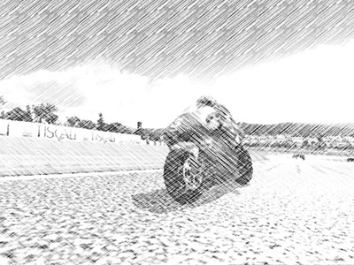
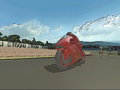
|
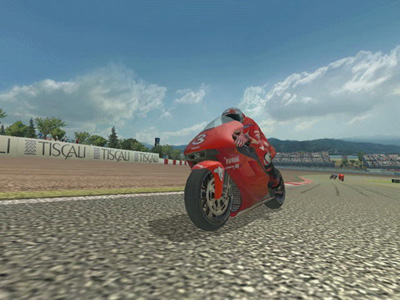
| Figure 1: the source image used by all the filters shown below |
Ok, so we are all set up to feed the output of our main renderer through the pixel shader of our choosing. What do we want that shader to do?
The most obvious, and probably most widely useful type of operation, is to perform some kind of colorspace conversion. This could be as simple as a colored tint for certain types of lens, or a gamma curve adjustment to simulate different camera exposure settings. The image could be converted to monochrome or sepiatone, and by swapping or inverting color channels, night vision and infrared effects can easily be imitated.
The most flexible way of transforming colors is to use the RGB value sampled from the source image as coordinates for a dependent read into a volume texture. A full 256x256x256 lookup table would be prohibitively large (64 megabytes if stored in 32 bit format!) but thanks to bilinear filtering of the volume texture, a much smaller table can still give adequate results. Even a small volume texture is still much bigger than a pixel shader, though, and its effects cannot so easily be changed just by modifying a few constants. So wherever possible I think it is better to do your work directly in the shader.
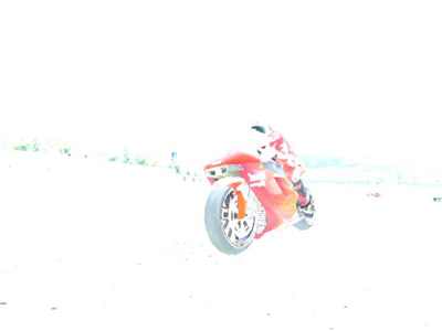
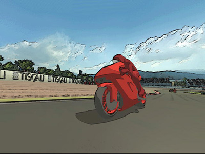
This is the saturation filter from MotoGP 2, the result of which is shown in Figure 2. It makes bright colors more intense and primary, while converting the more subtle tones to greyscale. This demonstrates several important principles of pixel shader color manipulation:
    ps.1.1

    def c0, 1.0, 1.0, 1.0, 1.0
    def c1, 0.3, 0.59, 0.11, 0.5

    tex t0                       // sample the source image

1:  mov_x4_sat r0.rgb, t0_bx2    // saturate
2:  dp3_sat r1.rgba, r0, c0      // do we have any bright colors?
3:  dp3 r1.rgb, t0, c1           // greyscale
4:  lrp r0.rgb, r1.a, r0, r1     // interpolate between color and greyscale
5:  + mov r0.a, t0.a             // output alpha
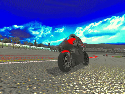 |
| Figure 2: color saturation filter |
Instruction #1 (mov_x4_sat) calculates an intensified version of the input color. The _bx2 input modifier scales any values less than 0.5 down to zero, while the _x4 output modifier scales up the results so anything greater than 0.625 will be saturated right up to maximum brightness. It is important to remember the _sat modifier when doing this sort of overbrightening operation, because if you leave it out, calculations that overflow 1.0 will produce inconsistent results on different hardware. DirectX 8 cards will always clamp the value at 1.0 (as if the _sat modifier was present) but ps 1.4 or 2.0 hardware will not.
Instruction #3 calculates a monochrome version of the input color, by dotting it with the constant [0.3, 0.59, 0.11]. It doesn't really matter what values you use for this, and [0.33, 0.33, 0.33] might seem more logical, but these values were chosen because the human eye is more sensitive to the luminance of the green channel, and less sensitive to blue. These are the same scaling factors used by the standard YUV colorspace.
Instruction #4 chooses between the saturated or monochrome versions of the color, based on what instruction #2 wrote into r1.a. That summed all the saturated color channels to create a boolean selector value, which will contain 1 if the input color was bright enough to saturate upwards, or 0 if the input was dark enough for the _bx2 modifier to round it down to black. In C this calculation would be:
color = (source brightness > 0.5) ? saturated color : monochrome color
The cnd pixel shader instruction seems ideal for such a task, but in fact it is almost always better to use lrp instead. A discrete test such as cnd tends to cause popping artefacts as the input data moves past its selection threshold, where a lrp can give a smooth transition over a range of values.
You can do color conversions by using the input color as source coordinates for a dependent texture read into a lookup table. But what if you reversed this, and used another texture as the source for a dependent read into the image of your main scene? The shader is trivial:
    ps.1.1

    tex t0                   // sample the displacement texture
    texm3x2pad t1, t0_bx2
    texm3x2tex t2, t0_bx2    // sample the source image

    mov r0, t2
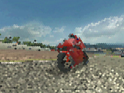 |
| Figure 3: hexagonal mosaic filter, using dependent texture reads |
but by appropriate choice of a displacement texture, all sorts of interesting effects can be achieved. Heat haze, explosion shockwaves, refraction of light through patterned glass, or raindrops on a camera lens. Or in this case, sticking with a non-photorealistic theme, the mosaic effect shown in Figure 3.
Our goal is to cover the screen with a grid of hexagons, each filled with a solid color. Imagine what a 160x100 CGA mode might have looked like if IBM had used hexagonal pixels...
This can be done by tiling a hexagonal displacement texture over the screen. The values in this texture modify the location at which the main scene image is sampled. With the right displacement texture, all pixels inside a hexagon can be adjusted to sample exactly the same texel from the source image, turning the contents of that hexagon into a single flat color.
The texture coordinates for stage 0 control how many times the displacement texture is tiled over the screen, while stages 1 and 2 hold a 3x2 transform matrix. If the hexagon pattern is tiled H times horizontally and V times vertically, your vertex shader outputs should be:
    oPos    oT0     oT1                                   oT2
    (0, 0)  (0, 0)  (0.5 * (right - left) / H, 0, left)   (0, 0.5 * (bottom - top) / V, top)
    (1, 0)  (H, 0)  (0.5 * (right - left) / H, 0, right)  (0, 0.5 * (bottom - top) / V, top)
    (1, 1)  (H, V)  (0.5 * (right - left) / H, 0, right)  (0, 0.5 * (bottom - top) / V, bottom)
    (0, 1)  (0, V)  (0.5 * (right - left) / H, 0, left)   (0, 0.5 * (bottom - top) / V, bottom)
left, right, top and bottom are the texture coordinates given in the "What Size Rendertarget" section.
The horizontal offset comes from the red channel of the displacement texture, and the vertical offset from the green channel. The blue channel must contain solid color, as this will be multiplied with the last column of the oT1/oT2 matrix to give the base coordinates onto which the displacement is added.
The only remaining question is what to put in your displacement texture. If you are good with Photoshop you could probably draw one using the gradient fill tools, but it is easier to generate it in code. My hexagon pattern was created by a render to texture using the function:
    void draw_mosaic_hexagon()
    {
        //            x    y    r    g    b
        draw_quad(Vtx(0.0, 0.0, 0.5, 0.5, 1.0),
                  Vtx(0.5, 0.0, 1.0, 0.5, 1.0),
                  Vtx(0.5, 0.5, 1.0, 1.0, 1.0),
                  Vtx(0.0, 0.5, 0.5, 1.0, 1.0));

        draw_quad(Vtx(1.0, 1.0, 0.5, 0.5, 1.0),
                  Vtx(0.5, 1.0, 0.0, 0.5, 1.0),
                  Vtx(0.5, 0.5, 0.0, 0.0, 1.0),
                  Vtx(1.0, 0.5, 0.5, 0.0, 1.0));

        draw_quad(Vtx(1.0, 0.0, 0.5, 0.5, 1.0),
                  Vtx(0.5, 0.0, 0.0, 0.5, 1.0),
                  Vtx(0.5, 0.5, 0.0, 1.0, 1.0),
                  Vtx(1.0, 0.5, 0.5, 1.0, 1.0));

        draw_quad(Vtx(0.0, 1.0, 0.5, 0.5, 1.0),
                  Vtx(0.5, 1.0, 1.0, 0.5, 1.0),
                  Vtx(0.5, 0.5, 1.0, 0.0, 1.0),
                  Vtx(0.0, 0.5, 0.5, 0.0, 1.0));

        draw_quad(Vtx(0.0, 0.333, 0.0, 0.333, 1.0),
                  Vtx(1.0, 0.333, 1.0, 0.333, 1.0),
                  Vtx(1.0, 0.667, 1.0, 0.667, 1.0),
                  Vtx(0.0, 0.667, 0.0, 0.667, 1.0));

        draw_tri( Vtx(0.0, 0.333, 0.0, 0.333, 1.0),
                  Vtx(1.0, 0.333, 1.0, 0.333, 1.0),
                  Vtx(0.5, 0.167, 0.5, 0.167, 1.0));

        draw_tri( Vtx(0.0, 0.667, 0.0, 0.667, 1.0),
                  Vtx(1.0, 0.667, 1.0, 0.667, 1.0),
                  Vtx(0.5, 0.833, 0.5, 0.833, 1.0));
    }
|

|
Rendering more complex animating patterns into the displacement texture can produce a huge range of cubist or pointillistic style distortions: check out the Kaleidoscope filter in MotoGP 2 for some examples. Scaling or rotating the offset values in oT1 and oT2 also gives interesting results.
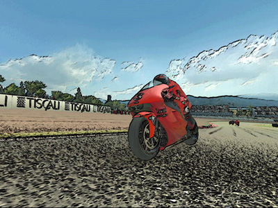 |
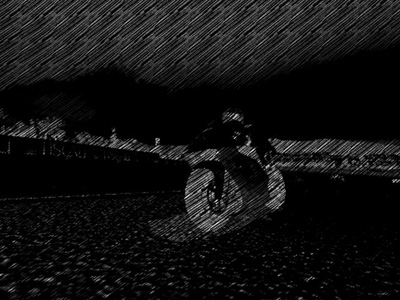
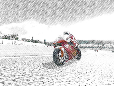
| Figure 4: the cartoon shader starts by applying an edge detect filter |
The main characteristics of a cartoon style are black lines around the edges of objects, and the use of flat color where there would normally be textured detail or smooth lighting gradients. There are plenty of ways of achieving these effects, most of which have been described in detail elsewhere, but the technique presented here is unusual in that it requires minimal changes to an existing renderer, and no artwork or mesh format alterations whatsoever.
The first step is to add black borders by running an edge detect filter over the image of our scene. This is done by setting the same texture three times on different stages, with the texture coordinates slightly offset. The pixel shader compares the brightness of adjacent samples, and if the color gradient is steep enough, marks this as an edge pixel by turning it black. This shader produced the image shown in Figure 4:
    ps.1.1

    def c0, 0.3, 0.59, 0.11, 0

    tex t0                     // sample the source image
    tex t1                     // sample offset by (-1, -1)
    tex t2                     // sample offset by (1, 1)

    dp3 r0.rgba, t1, c0        // greyscale sample #1 in r0.a
    dp3 r1.rgba, t2, c0        // greyscale sample #2 in r1.a

    sub_x4 r0.a, r0, r1        // diagonal edge detect difference
    mul_x4_sat r0.a, r0, r0    // square edge difference to get absolute value

    mul r0.rgb, r0, 1-r0.a     // output color * edge detect
    + mov r0.a, t0.a           // output alpha
More accurate edge detection can be done by using a larger number of sample points, or by including a depth buffer and looking for sudden changes in depth as well as color (see the ATI website for examples), but in this case we don't actually want that precise a result! With the samples offset along a single diagonal line, the filter favours edges in one direction compared to the other, which gives a looser, more hand-drawn appearance.
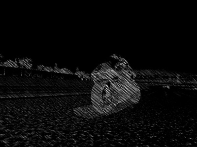
 |
| Figure 5: changing the mipmap settings to remove texture detail |
Image based edge detection can pick out borders that would be impossible to locate using a geometric approach, such as the lines around individual clouds in the sky texture.
Getting rid of unwanted texture detail is not so easy to do as a postprocess, so for that we do need to change the main rendering engine. This is a trivial alteration, however, as you undoubtedly already have flat color versions of all your textures loaded into memory. Simply set D3DSAMP_MAXMIPLEVEL (or D3DTSS_MAXMIPLEVEL in DX8) to something greater than zero, and all that nasty high resolution texture detail will go away, as shown in Figure 5.
While you are at it, if you have any alpha texture cutouts such as trees, a few trivial changes can make their black borders thicker and more solid. You probably already have a good idea how to do that, as the chances are you spent quite a while trying to get rid of those very same black borders at some point in the past! If you are using premultiplied alpha, disable it. If you are using alpha blending, turn it off and go back to simple alpha tests. If you have D3DRS_ALPHAREF set to something sensible, change it to 0 or 1. Instant black borders around everything you draw!
Unfortunately this still isn't quite enough to give a plausible cartoon effect, so I'm going to have to break the "no new shaders" rule and change the lighting model. Smooth gradients from light to dark just don't look right in a cartoon world. The lighting should be quantised into only two or three discrete levels, with sudden transitions from light to shadow.
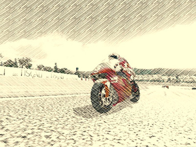
 |
| Figure 6: the complete cartoon mode uses a discrete three-level lighting shader on bike and rider |
This is easy to do with a texture lookup. Discard everything but the most significant light source, and then in your vertex shader, output the light intensity as a texture coordinate:
    #define LIGHT_DIR 1

    dp3 oT1.x, v1, c[LIGHT_DIR]
This light value is used to lookup into a 1D texture containing three discrete levels of brightness:
Figure 6 shows the final cartoon renderer, combining the edge detect filter, changes to the mipmap and alpha test settings, and three-level quantised lighting. It isn't quite a pure postprocessing effect, but still only required three new shaders: one pixel shader for the edge detection, and two vertex shaders for the toon lighting (one for the bike, another for the animating rider).
The most important characteristics of a pencil sketch can be summarised as:
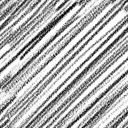
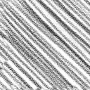
The first step is obviously to create a texture holding a suitable pattern of pencil strokes. I used two images, with slightly different stroke graphics aligned in opposite directions:
These are combined into a single texture, with the first stroke pattern in the red channel and the second in the blue channel. This combined stroke texture is tiled over the screen, set on texture stage 1, while the main scene image is set on stage 0. This is then processed through the shader:
    ps.1.1

    def c1, 1.0, 0.0, 0.0, 0.0
    def c2, 0.0, 0.0, 1.0, 0.0

    tex t0                       // sample the source image
    tex t1                       // sample the stroke texture

1:  mul_x4_sat r0.rgb, t0, c0    // scale the framebuffer contents
2:  mul r0.rgb, 1-r0, 1-t1       // image * pencil stroke texture

3:  dp3_sat r1.rgba, r0, c1      // r1.a = red channel
4:  dp3_sat r1.rgb, r0, c2       // r1.rgb = blue channel

5:  mul r1.rgb, 1-r1, 1-r1.a     // combine, and convert -ve color back to +ve

6:  mov_x4_sat r0.rgb, t0        // overbrighten the framebuffer contents

7:  mul r0.rgb, r1_bx2, r0       // combine sketch with base texture

8:  mul_x2 r0.rgb, r0, v0        // tint
9:  + mov r0.a, v0.a
Instruction #1 scales the input color by a constant (c0) which is set by the application. This controls the sensitivity of the stroke detection: too high and there will be no strokes at all, but too low and the strokes will be too dense. It needs to be adjusted according to the brightness of your scene: somewhere between 0.25 and 0.5 generally works well.
Instruction #2 combines the input color with the stroke texture, in parallel for both the red and blue channels. It also inverts both colors by subtracting them from one. This is important, because sketching operates in a subtractive colorspace. Unlike a computer monitor which adds light over a default black surface, a pencil artist is removing light from the white paper. It seems highly counterintuitive from my perspective as a graphics programmer, but the hatching in the blue sky area is actually triggered by the red color channel, while the hatching on the red bike comes from the blue channel! This is because there is no need for any hatching to add blue to the sky, all colors already being present in the default white background. On the contrary, the sky needs hatching in order to remove the unwanted red channel, which will leave only the desired shade of blue. We are drawing the absence of color, rather than its presence, and this means we have to invert the input values to get correct results.
Instructions #3 and #4 separate out the red and blue color channels, creating Figure 7 and Figure 8, while instruction #5 combines them back together, producing Figure 9. Although this is purely a monochrome image, the input color is controlling the direction of the stroke texture. The blue sky and red bike are shaded in opposing directions, while dark areas such as the wheels combine both stroke directions to give a crosshatch pattern.
Instruction #6 scales up the input color by a massive amount, producing Figure 10. Most of the image has been saturated to full white, with only a few areas of intensely primary color retaining their hue. When this is multiplied with the sketch pattern (instruction #7, producing Figure 11) it reintroduces a small amount of color to select parts of the image, while leaving the bulk of the hatching in monochrome.
The final step, in instruction #8, is to apply a colored tint. Figure 12 shows the final image with a sepia hue.
This is all very well for a still image, but how ought a pencil sketch to move? It looks silly if the pencil strokes stay in exactly the same place from one frame to the next, with only the image beneath them moving. But if we randomise the stroke texture in any way, the results will flicker horribly at anything approaching a decent refresh speed. Real sketched animations rarely run any faster than 10 or 15 frames per second, but that is hardly desirable in the context of a 3D game engine!
My compromise was to run at full framerate, redrawing the input scene for each frame, but to only move the stroke texture at periodic intervals. The low framerate movement of the pencil strokes can fool the eye into thinking the scene is only being redrawn at a plausible pencil sketch type of rate, but it remains smooth and responsive enough for a player to interact with the underlying game.
|
|
|
|
|
|