Great albums depend on more than just the individual notes. After the musicians finish recording their parts the producer takes over, adjusting volume levels and equalization settings, or maybe adding a bit of reverb to make everything sit well in the mix.
Game artwork works the same way. Any time you draw more than one thing on the screen you need to think about how well their colors, brightness, and contrast levels will fit together. By far the most important tools for controlling this are the lighting and fog settings.
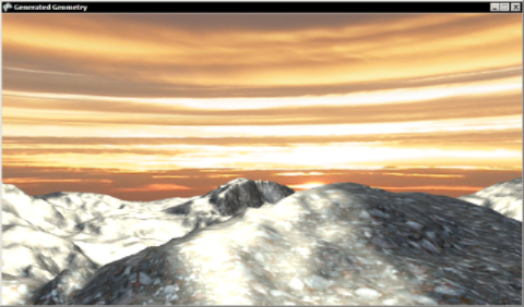
The Generated Geometry sample contains two objects: a skydome and some ground terrain. Here's what it would look like if we used BasicEffect.EnableDefaultLighting for the terrain:
Pretty ugly, but there is already one thing right about this: the lighting on the ground matches the position of the sun in the sky texture. If these didn't line up we would have to rotate the skydome or change the direction of the light.
To improve the terrain lighting we'll change the specular color to match the sky, and turn down the specular power to soften the highlights:
    // Set the specular lighting to match the sky color.
    effect.SpecularColor = new Vector3(0.6f, 0.4f, 0.2f);
    effect.SpecularPower = 8;
This gives a much more plausible looking result:
Turning the camera the other way, you will see some distant hills drawn directly into the skydome texture, visible here as the dark shape on the left:
These don't blend very well with our terrain mesh. The hills modeled into the terrain look nothing like the ones that are drawn on the skydome, and the join between the terrain mesh and skydome hills is far too obvious.
We can improve this by enabling fog, and setting our fog color to match the skydome:
    // Set the fog to match the distant mountains
    // that are drawn into the sky texture.
    effect.FogEnabled = true;
    effect.FogColor = new Vector3(0.15f);
    effect.FogStart = 100;
    effect.FogEnd = 320;
The skydome hills on the left now look almost identical to the distant modeled hill on the right, and it is much harder to spot where the terrain mesh ends and skydome begins:
Fog can easily be overused: you don't want to end up looking like a Nintendo 64 game after all! But when applied subtly it can do wonders to tie your visuals together. Choose a color that goes well with your sky texture, set the FogEnd parameter nice and far away, then sit back and enjoy the resulting visual cohesion.